Wednesday, 16 January 2013
Friday, 4 January 2013
Assassins Creed 4 Cover

Wednesday, 5 December 2012
Another Thumbnail Idea

Thursday, 29 November 2012
Assassins Creed Thumbnail Idea

Sunday, 25 November 2012
Assassins Creed Character Design

Friday, 16 November 2012
Deconstruction Analysis

Bit obssesed with this work but I decided to post my deconstruction.
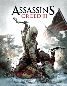
This is the Assassins Creed III special cover designed by Alex Ross. The kind of media used for this was drawing/painting which was then scanned a digitally enhanced through computer software. The piece was created on the 3rd of September 2012 for the Assassins Creed III special release edition which was released a couple of months later. The main aspects of the painting include: a cliff edge, the main Character with all his equipment and finally the original American flag in the background. These three main focuses make the cover simple yet very effective.
There are no strong black outlines on this piece; the artist has kept everything smooth looking especially in the background and the cliff edge. Though once we look at the main figure in the work you straight away notice the amount of detail and precision included into the image to make it look as life like as possible. It seems that in this work all the background art of the flag and the cliff edge seem to be all curvy lines with no strong lines and edges though when looking at the centre character the detail is enhanced dramatically with lines and details being worked on thoroughly thus making the character the eye catching most appealing thing of the image. All the content in this piece is very central with nothing being too far to the side of the character though saying this his arms do reach out to either sides of the painting but even so everything remains balanced the arms for example being mirrored on both sides this is to balance out the picture and keep the main focus on the very centre.
The tone of the picture originally seems light but once look more in detail with the shadows and the colours you can tell the piece is more dark and gloomy, this is proven with the blizzard storm effect wiping across the whole image with the colours being smudged in some places. The colour used is limited in this piece with only the flag being the main provider with the bright red and blue colouring though there are some shades of gold and brown included. The obvious main colour is white most of the image is created with it giving the painting a sense of purity and hope, this is unexpected with the blood inclusion on the hood and the vast amount of weapons though once reading the character description it easily realised why it is used. A lot of attention is paid to depth and shadowing in this piece of work with everything seeming 3D and in some ways real, I believe this was purposely done to show that the game can be real in some ways and defiantly attracting audience attention
The painting was created for the front cover of a limited addition of Assassins Creed III, the art gives you in some cases a sense of fear with the armed figure staring towards you though in some cases for me especially I look at the character and aspire to be like him, being bold strong and on his own makes him seem like a kind of superhero but in this case a somewhat believable one. With the use of the old United States flag and the weaponry held by the character you can see that the cover is based majorly on the revolutionary war. With the war being based on soldiers and colonies it is obscure to see one figure standing by himself with no colonel costume being worn or even hinted. The way the painting is showing the character standing on a cliff edge gives him the meaning of strength with the weaponry enhancing the fact. The head and eyes are slanted down with the hood shadowing the main features of his face giving the character a mysterious feel and also a sense of no fear with no eye contact needed.
I really enjoy this piece of art, the uses of colours and texture indulges me into the piece a lot and it intrigues me to find out who the hooded character is and what his purpose is. I think the use of paint is exquisite with the textures and use of blur, but also the intense detail involved with the character all the equipment all looks to have taken a lot of work to create. Though it is subtle I also think that the computer use worked nicely with any rough edges and small mistakes fixed, also the lighting enhanced dramatically from the original painting, this all adds up to help the piece look a bit better and all works nicely. Being a game cover I do not think the artwork would be suitable for a galley or museum but I do think that for the purpose of being a game cover it is extremely good. I would defiantly at least view this game if looking in a shop as I believe the design is very unique and different which catches everyone’s eyes also the mystery involved makes you want to find out more about the game itself.
Horia Dociu Thoughts
This guy has some great ideas and his works are excellently produced anyone wanting to see more of his work here is the link to his blog badideafactory.
Whilst
browsing through the web I found Horia Dociu's blog I really liked his style of
work, it fitted in with what I wanted to produce nicely. From backgrounds to
character design Horia try both with his unique working style, some of his work
looking very realistic whilst others include lots of detail as well as varieties
of colours to make it as appealing as possible especially to me. Unlike
the other artists in which I have researched Horia Dociu does not specialise in
comic book art for any companies, instead he produces his own images in his own
spare time. The main reason I enjoy his work is that it links best to my
project theme; I would like to reflect especially in his style of character
design to create pieces inspired by him.


Thursday, 15 November 2012
Alex Ross Experiment

Had a go at painting one of Alex Ross's Assassins Creed pieces any feedback? Ideas on what to improve anyone?
Sunday, 11 November 2012
Alex Ross

 Alex Ross is a comic book artist who specialises in Marvel and DC comics, as well as doing some art for selected game covers including Assassins Creed 3. I chose Ross as one of my inspired artists because of his great use of colour and light. All his work seems to include a variety of colour which really attracts the eye to his works.
Gregg Horn
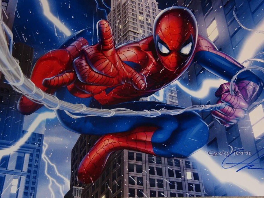
For one of my inspired artists I decided to
choose Gregg Horn an illustrator and designer of some gaming products and also
an artist for some Marvel and DC comics. He is a very modern illustrator and is
currently still producing work today. The aspect of his work that I especially
enjoy about his work has to be his use of light and shadow. Though I am unsure
on how he produces his images I do believe that they are first drawn then
coloured and detailed on Photoshop, which the use of is fantastic in all his works.
All his work has a sense of realism to it as well as the obvious cartoon affect
this I believe makes his work come to life in a way making a viewer a lot more
interested. Because of this work being very interesting and appealing for me
and the artwork being fairly mature I believe Gregg horns work is targeted a
lot towards the teenage/ young adult audience his uses of colour, effects,
shadow/light etc makes it intriguing to view for anyone but most so the ages of
13-20. A lot of bold bright colours are used in his work and his use of texture
I believe is exquisite with only smooth colours and not black outlines which is
strange considering most comics include a lot of black outlines.

Gregg Horn specialises in comic book scetching which gives him a sense of uniqueness as I believe all comic book artists have there own original way of designing ideas. The aspect I most like about him is that he is very modern, his work does not follow the usual comic book style with block colours, his designs nmake the comic book characters seem to come to life in a way. Aswell as comic book art he also has some designs of video games icluding halo and also some movie art including the Fast and The Furious, this make him a very open artist who does not only work on one set theme. I think that Gregg Horn will help me alot for ideas for my project as his use of colour and compisition I believe is very nice and is something that I would like to reflect on in some of my work.

Guitar Hero 3 Cover
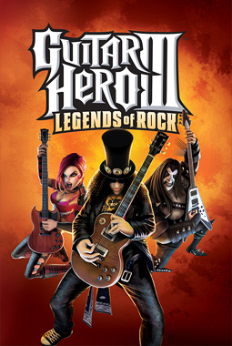
Guitar Hero is a great franchise, really like the use of Slash in the cover, one of the reasons I bought the game.
Need For Speed Shift Cover

Maybe a racing game? All Need For Speed covers seem to be nicely done with alot of effects added.
Halo 4 Cover
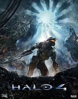
Another recent release Halo 4 looks like an amazing game really like the lighting involed in the cover aswell as the small details.

Assassins Creed 3 game cover
Love the Assassins Creed franchise big competitor for my concept cover, really nice faded backround effect makes the character stand out alot.
My Idea

Subscribe to:
Posts (Atom)